


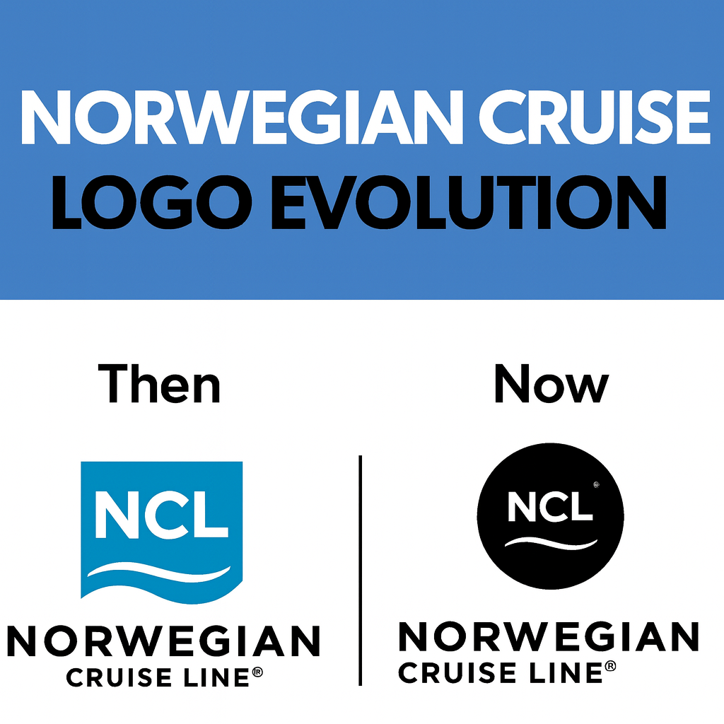
Norwegian Cruise Line has quietly rolled out a major visual shift—retiring its iconic blue logo in favor of a sleek black design and debuting a new slogan: “It’s Different Out There.”
The sudden change has sparked plenty of conversation among cruisers and industry watchers. The familiar blue wave—synonymous with NCL for years—has now been replaced across the company’s website and social channels, paired with a teaser promising that “something different is coming.”
So far, NCL hasn’t shared details about what the update means. Some guests are wondering whether the black logo hints at a more premium, adventurous, or modern direction for the brand. Others think it may be the start of a broader 2026 marketing campaign.
Adding to the mystery, NCL recently released a series of cryptic, 1700s‑inspired videos that have left viewers guessing about what’s next.
Norwegian Cruise Line, part of Norwegian Cruise Line Holdings Ltd., operates 19 ships sailing worldwide. The company has not yet commented on the meaning behind the new visuals.
Some market analysts suggest the shift could be a strategic move to help NCL stand out in an increasingly competitive cruise landscape.
Whatever the reason, one thing’s clear: change is on the horizon. And at Pride And Passport, we’re always watching for the updates that shape your next unforgettable voyage.
Contact us today to book your next great adventure!

Leave a Reply